Image: UKRI
Umbrella funding body spent £95,000 on rebranding to reflect unity of the research councils
UK Research and Innovation’s rebranding has left some researchers scratching their heads.
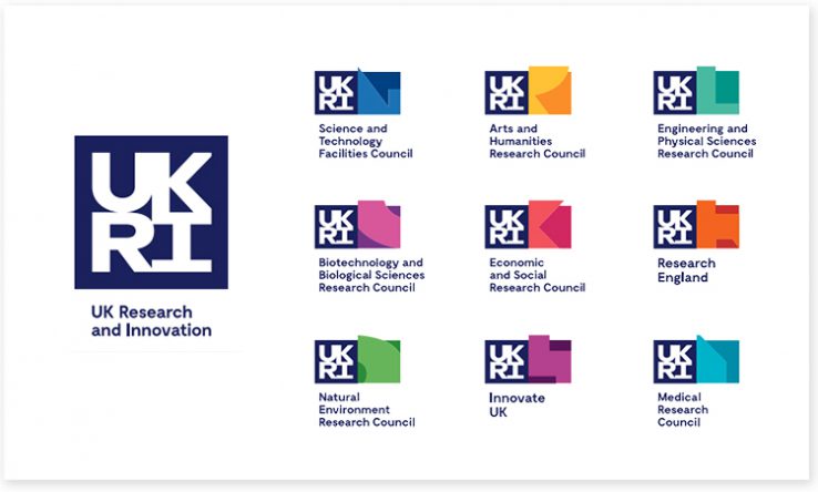
Unveiled on 10 October, it includes a new UKRI logo with joined-up lettering, which splits into individual logos for each of the councils. This is intended to represent the unity of the research councils and the innovative nature of the work that they fund. Each funder is colour-coded and has its own geometric shape.
The brand, developed by the creative agency Dragon Rouge, cost £95,000 to develop, including work across the nine research councils.
“This included audit and insight work, creative development, internal and external engagement to test and refine the concept, and artwork and guidelines,” a UKRI spokesman told Research Professional News.
While acknowledging the need for a unified brand since the creation of UKRI, Kieron Flanagan, a senior lecturer in science and technology policy at the University of Manchester, was unsure about the design. “The UKRI logo itself looks a little clumsy and bombastic to me, and the individual research council brands seem over-complicated, though I am not a design consultant,” he told Research Professional News. “However, I do like the colour coding.”
Alexandre Coates, a PhD student at Heriot-Watt University, was less forgiving. “Just been told about the UKRI logo redesign and my eyes are on fire,” he tweeted. “The UKRI block is hard to read because the letters all bleed into each other, and all the councils are just bits of letters. The Engineering and Physical Sciences Research Council is represented by what looks like an L?”
Mark Smith, programme manager for a knowledge exchange project on antimicrobial resistance funded by Research England, described the logo as “puzzling”. “In fact, it’s rather like the little childhood puzzles where you slid plastic letters up and down or side to side until the right picture appeared!” he tweeted.
Philip Moriarty, a professor of physics at the University of Nottingham, noted that UKRI’s branding document said: “We’re prepared to do things differently.”
“They’ve changed the logo. That’s it. And they’ve written a load of accompanying ‘inspirational’ bumpf to attempt to justify the £90,000 spent on something that looks rather like an upper-end GCSE art and design technology project,” Moriarty told Research Professional News. “That’s not doing things differently. That’s exactly what every other brand-obsessed company does.”
However, not everyone was negative about the new logo.
Emma Leech, director of marketing at Loughborough University and president of the Chartered Institute of Public Relations, said the logo provided “a great platform for UKRI to build on”. “It’s fresher, more modern looking and more consolidated, with sufficient scope to allow different areas to develop and express personality under a recognisable umbrella,” she told Research Professional News.
UKRI spokesperson said “These comments are all valid personal opinions.”
According to UKRI’s announcement, the new brand “provides a strong identity for the organisation as it realises its ambitions as a world-class funder delivering global impact”.
Mark Walport, chief executive of UKRI, said the funder had an “important role to play and an important story to tell”.
“The unified brand will help us to tell this story nationally and internationally,” he said. “It shows how the organisation brings together the seven research councils, Research England and Innovate UK to deliver on our ambitions as a world-class funder, creating knowledge with impact across society and the economy.”